
Webflow AI Site Builder: My HueSync First Look
I used a fictional Canadian agency, HueSync, to explore Webflow's AI site builder. The first look showed a useful starting layout, followed by editing work inside.
 Webflow
I used a fictional Canadian agency, HueSync, to explore Webflow's AI site builder. The first look showed a useful starting layout, followed by editing work inside Webflow. I still needed to review the copy, images, forms, and mobile spacing.
The HueSync experiment
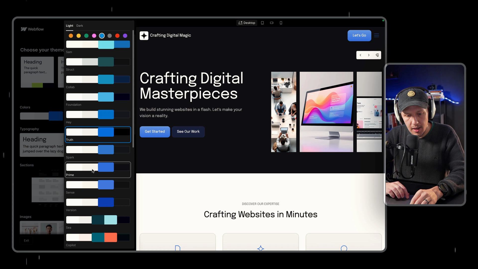
My prompt described an agency website and its intended style. The generated options included minimal, futuristic, elegant, and bold directions. I explored layouts, images, colors, fonts, and styles for buttons, forms, and cards. Those choices helped me compare visual directions before editing individual sections.
Use fictional details only while testing. Replace invented services, testimonials, and business claims before publishing. A generated image can suit the layout while still failing to represent your business.
What the current builder requires
Webflow's current instructions apply to new sites and existing AI-generated sites. You cannot apply this builder to an existing site created another way. Enable Webflow AI in Workspace settings first. Without a paid Workspace or Site plan, the site has a two-page limit, excluding its generated style guide. Paid plans support up to five initial pages and additional pages afterward.
Describe the audience, purpose, required pages, colors, and fonts in your prompt. Review the proposed structure before generating the site. Regenerating the structure replaces existing structure edits, so save your decisions before restarting.
Move from a draft to a usable site
In my first look, the generated layout and shared styles carried into Webflow. The images felt generic, and the copy needed rewriting. Forms and buttons also required manual attention.
I generated a Contact page to compare its styling with the homepage. Its fonts, colors, and spacing followed the existing direction. That visual consistency did not establish a working contact flow. Configure the form destination and test delivery with a permitted address.
Customize shared styles once
I used variables to adjust shared fonts and colors. A variable updates elements that actually reference it. Check manually styled sections when a global change leaves inconsistent results. The generated style guide is a useful place to review buttons, cards, spacing, and typography together.
If you prefer designing the system first, import a Relume style guide before refining page details. Avoid mixing several class systems without deciding which one controls shared styles.
Review desktop and mobile
The generated site looked promising on mobile during my first look. Some sections still needed padding and spacing changes. Inspect the published draft near 390px and on desktop. Check navigation, text wrapping, image crops, buttons, and keyboard use.
The builder can provide a draft structure quickly. Your content, brand, and delivery checks still determine launch readiness. Use these Webflow building practices to keep the editing process manageable.
Keep learning
More guides, free videos and course access for existing members, all in one place.
Go to LearnRather have it built for you?
We'll match you with vetted agentic talent who build it with AI, inside the tools you already use.
Schedule a callRelated posts

Circle AI Agents Review: Automate Community Management with AI
Read my Circle AI Agent tests, current plan notes, and a support-demand method for evaluating cost and answer quality.

How to Import Relume Styles and Pages into Webflow
Approve a Relume sitemap and style direction, import one page into Webflow, and check classes, content, and accessibility.

Skool vs. Circle: Which Platform is Best for Managing and Scaling Your Online Community?
Compare Circle and Skool through navigation, automation, current advertised plans, and clearly labeled cost assumptions.